FB: "How about this one?"
ME: "No, my face looks like a fat chimp."
FB: "OK, this one?"
ME: "I look like a horse on sleeping pills."
FB: "OK, maybe this one?"
ME: "Yeah, if the title of my album was Triple Chins."
FB: "OK this? You look beautiful here."
ME: "Sure, if you're into giant bag eyes."
FB: "Where do you see any bags? There's NOTHING THERE."
ME: "If you truly cannot see the steam trunks of luggage under my eyes, then I don't know what to tell you. No way. This is NOT the album cover. NEXT."
Sigh.
My art direction for my album cover has been shamelessly narcissistic and simple:
Hot picture of me.
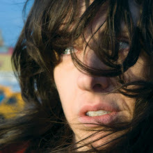
I don't really care what style, what colors, what genre, whatever. As long as I look smoking hot, it's AWESOME by me. I have picked apart at least 250 photos of myself, crazily scanning every inch of my face for the flaws. The major problem I have run into is that apparently in a photo shoot, my "sexy" look actually reads as "I hate you/die now/I am miserable and want to kill everyone."
Thankfully, before I had to resort to watching America's Next Top Model for clues (actually, I'm lying...I have already watched every episode of every season, who am I kidding?), FB found a treasure trove of photos he took of me in Coney Island before we left New York. The second I saw them, it hit me. These are the album art.
Score.
Coming soon, hehe.
Subscribe to:
Post Comments (Atom)

1 comment:
Dana,
I'm so fucking proud of you, but jealous at the same time. Holy fucking shit savate in France. That's like taking KungFu in China. Savate which translates to an old pair of shoes was Bruce Lees main art and the basis of Jeet Kune do. You should take your lazy ass Frenchboy there. Your old friend Gary New Jersey.
Post a Comment